Branding calmness for HabiWe
The HabiWe(R)’s brand is silence and calmness paired with luxury design and functionality. This is how these qualities were brought to life in the first marketing campaign for the Habi(R)Cave.
Role: Art director / Junior creative director/ Graphic designer, illustrator and animator / Assistant copywriter /
Copywriter: Mia Busk Hansen
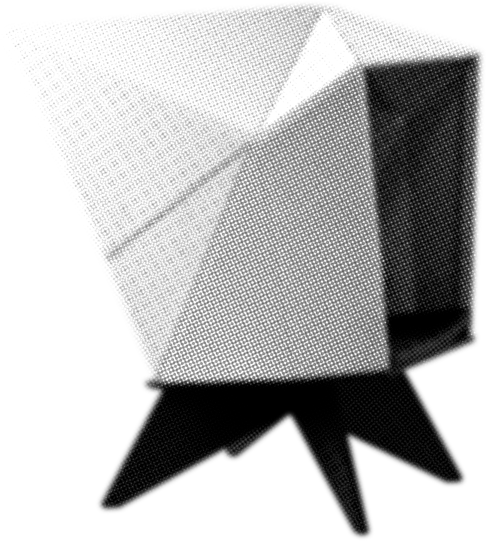
Japandi design
(Japanese/Scandinavian design)
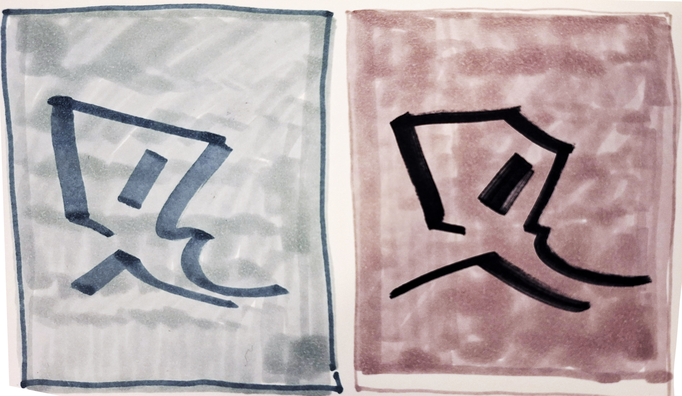
Insight: The chair design takes inspiration from japanese origami but is designed in Denmark. This campaign concept relates the design-story to zen and calmness associated with japanese philosophy.
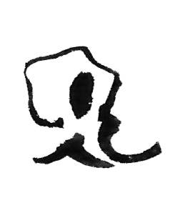
The visual language
The campaign blends aesthetics associated with classic danish furniture advertisements, like focusing on the most iconic features of the design, with the simplicity of japanese visual design.
One concept also simplifies the shape language of the chair into a kanji-like symbol.

The Pomodoro Method
Insight: This campaign is based on research into the Pomodoro Method, which states thats 2x5 minutes of rest recharges your mind.
The pomodoro name comes from the original method using a tomato-shaped kitchen timer to time the rest time.
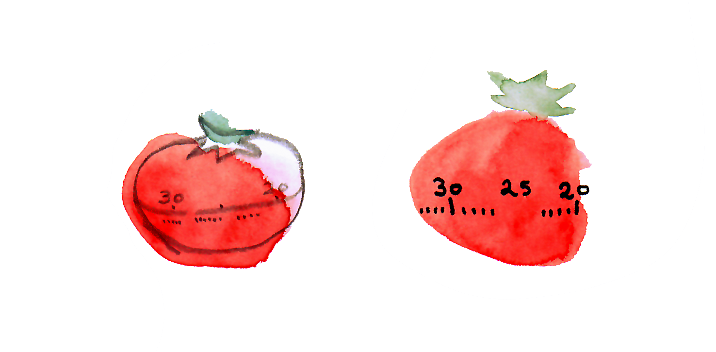
Visual language
The chair is depicted as a visual metaphor for the pomodoro timer. This visual positions the chair as the instrument for rest and recharging.
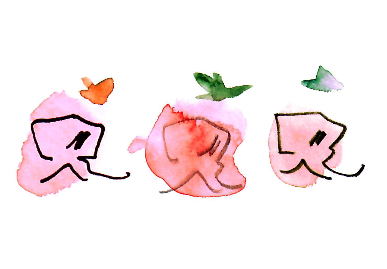
The animated approach
In the animated part of the campaign, a clock is used to show the idea of 2x5 minutes resting time. The chair is also shown to buzz with energy, which is then chanelled into whoever is resting in it.
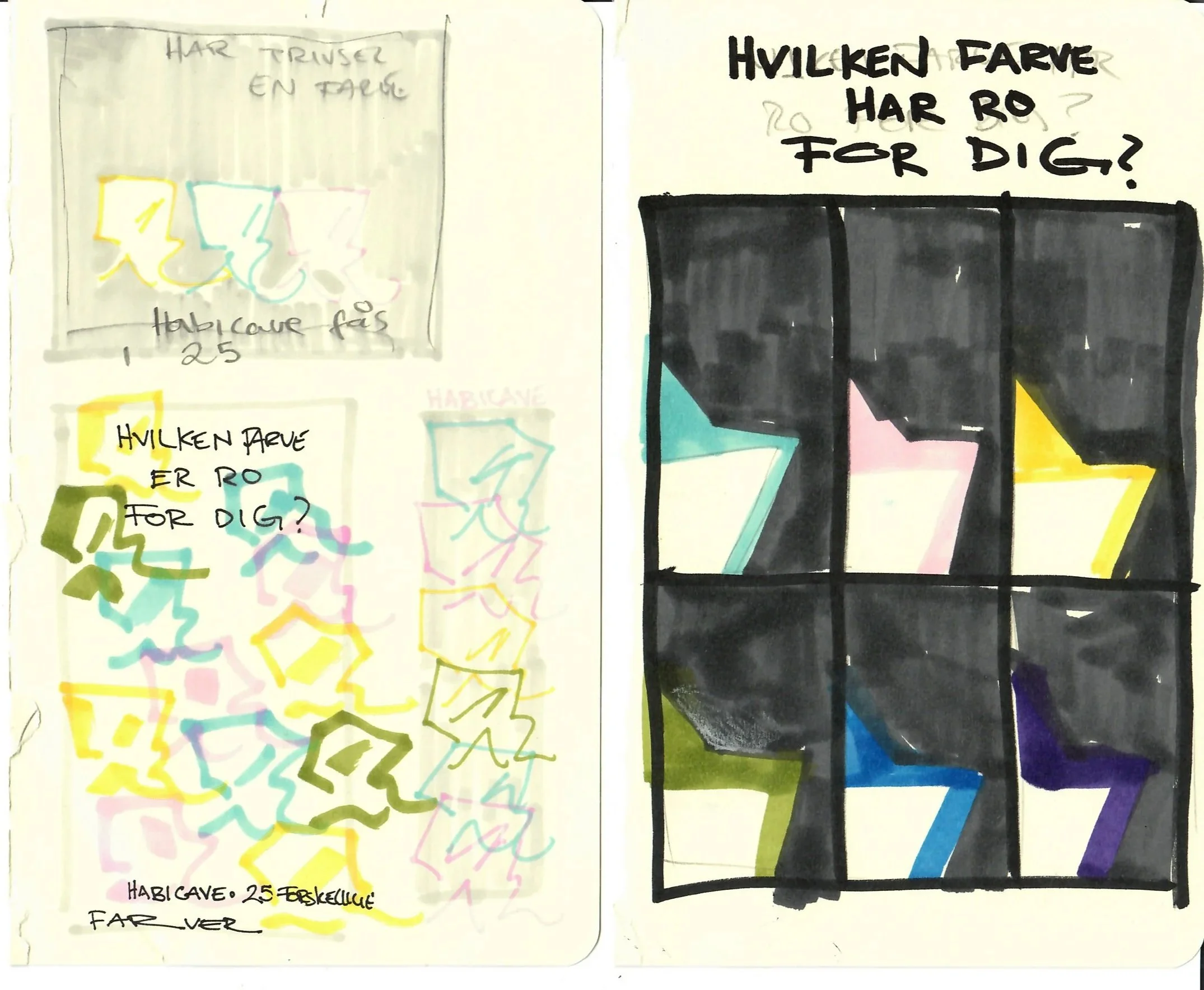
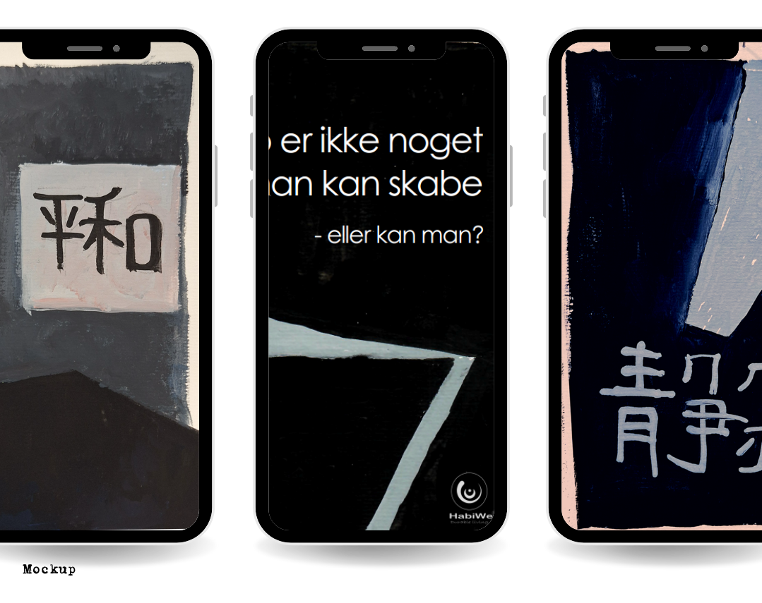
“What colour is your peace?” campaign idea proposal
Insight: one of the selling-points of the chair is the many colour options. This campaign relates the many colour-options to the need for peace and calmness being different for every person. The chair is able to satisfy a large range of needs for calmness, whether the user needs a place to take a work call or needs a quiet refuge to recharge.